How to Make Your Website Responsive in 2022
Posted on
May 17, 2021
by

in
Web Development
Did you know that more than half of all the website traffic comes from mobiles?
52.2% of all website traffic is generated from mobile phones.
People are so used to accessing the Internet via mobiles that they think twice about using a desktop for the same.
Well, the chances are high that you are reading even this blog on your mobile!
Don’t you think your website visitors do the same?
Imagine the number of visitors that access your website via mobile.
What if they don’t find your website to be responsive on their mobile?
They will immediately leave, meaning they will ‘bounce’ from your website.
Bounce rates on websites accessed via mobiles stand tall at 67%!
So, with a website that’s not responsive, your visitors will eventually get tired of all the pinching and zooming and opt for a competitor who has a responsive website. In the long run, your website will lose more traffic than it generates.
That is why it’s important to have responsive websites.
In this article, we are going to make your WordPress website responsive in just three steps,
Before going into how you can make your WordPress website responsive, let’s look at why you need one in the first place.
Mobile users have grown so large in number that it has become mandatory for all websites to become responsive. The fact that your visitors can access your website anytime, anywhere has made mobile a better choice than computers.
Having a responsive website has become more than a necessity because,
A responsive website gains your visitors’ trust in the long run. A website made for the desktop may not even look good on a small mobile screen, so you can forget the idea of your customers trusting your website and sharing their information.
Whereas a responsive website gives your visitors the best website experience possible and stays with them for long, thus increasing your credibility.
Accessing a traditional desktop website via mobile will be a nightmare for the visitors. They will have to zoom in and out of the various text and image elements, which is not quite practical. On the other hand, with a responsive website, your visitors will have a rich user experience and easy navigation across the website.
Also, they will be able to contact you in no time, as the contact information like Contact number and Email address can be clicked and directly accessed via mobile.
This gives you an edge over your competitors who don’t have responsive websites for their business.
That’s right! Google wants you to have responsive WordPress websites. That’s one of the criteria by which Google and even other search engines rank your website in the Search Engine Results Pages (SERPs).
They take into account how responsive your website is and only then rank it on the search pages accordingly. So, the more mobile-optimized your WordPress website is, the better ranking you will get on the Search Engine Results Pages (SERPs).
So, even though you sweat it out on creating the perfect website for desktop users, if your website is still not mobile optimized, you will most probably lose your ranks in the SERPs.
Now you know why a responsive WordPress website is important.
But, before we make your website responsive, there is a crucial step we need to do.
We need to check whether your website is responsive or not!
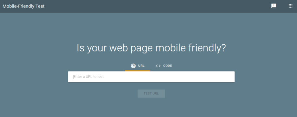
To check whether your WordPress website is responsive, head to Google’s mobile-friendly test page and enter the URL of your website.
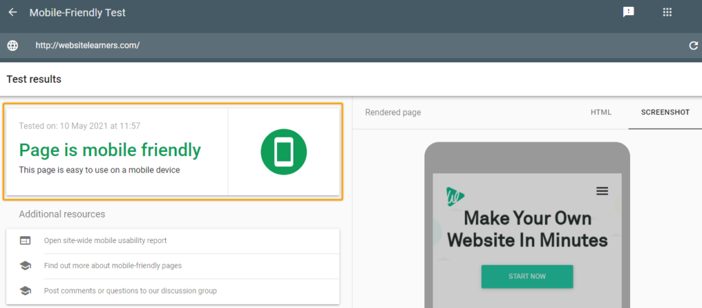
In a couple of seconds, Google analyses your website and comes up with the result. This is how a responsive website shows up in the result.
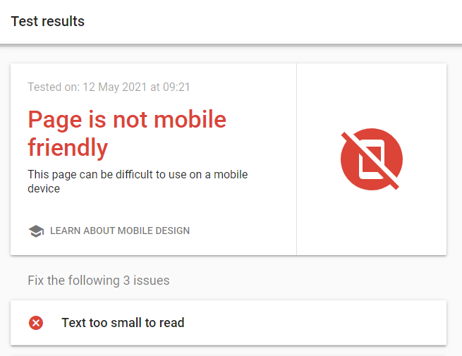
And this is how a website that’s not responsive is displayed in the result.
Even if you have randomly selected a WordPress theme, chances are there for your website to pass the test. It’s because most WordPress themes nowadays are responsive, and it has sort of became a standard.
But, no matter how responsive the theme is, it pretty much tries to have the same desktop design on to the mobiles. And most times, you may not be able to customize the mobile version as you want it to be.
That is why you should have a unique theme that’s custom-made for mobile, all without disturbing the layout or content of your desktop version.
Now let’s see,
If you already have a website, you can skip Step 1 and proceed from Step 2. In case you don’t have a WordPress website yet, you can easily create one by following Step 1.
The first step in creating a WordPress website, or any website for that matter, is to get domain and hosting. We need to take into consideration several factors before coming up with a hosting provider.
Now we are going to register our domain and get hosting from the most trusted hosting provider, Bluehost. Starting at just ₹199/month, Bluehost has several affordable plans that will rightly fit your budget. To start, choose the hosting plan of your choice. They have several Budgets as well as Premium hosting plans suitable for everyone.
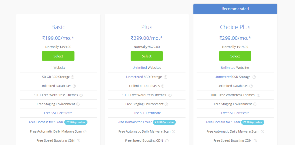
The reason why we chose Bluehost is that it is one of the most trusted hosting providers in the WordPress hosting market.
In fact, Bluehost is one of the three official hosting recommendations by WordPress. Also, with its Free SSL, and 50GB storage even on a basic plan, Bluehost is the ideal choice for beginners.
After carefully analyzing the hosting plans, and choosing one of your choice, you will be redirected to set up your Domain. Here, you can either,
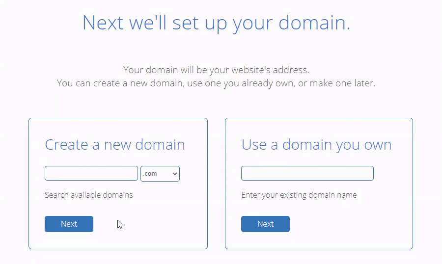
If you have decided to register a new domain name, you need to first check on its availability.

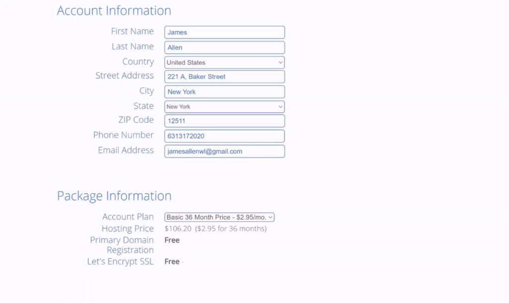
If the domain of your choice is available, you can then include the Account and Package information to proceed with the purchase.
Then you can enter the payment information and complete the transaction.
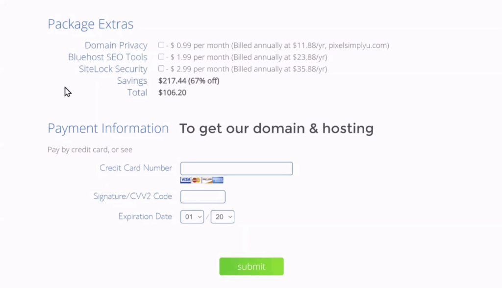
Now, you have successfully purchased Domain and Hosting for your WordPress website. Once you install WordPress on your hosting provider’s dashboard, your website will be live.
With your website live, do check with Google’s responsive test once, before proceeding to install the plugin.
Here it is, what you have been waiting for! Let us look at how you can install the plugin and make your website responsive in just 3 steps,
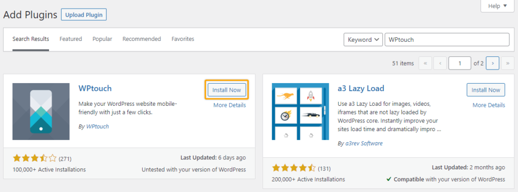
Go to Plugins from the dashboard area and select Add New.
In the Add Plugins section, search for the WPtouch plugin, the one that’s going to make our website responsive.
In the WPtouch section that’s at the top of the search results, select Install Now.
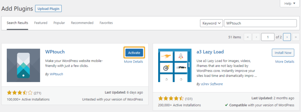
Once the plugin is installed, click on Activate to activate the plugin.
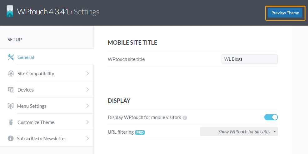
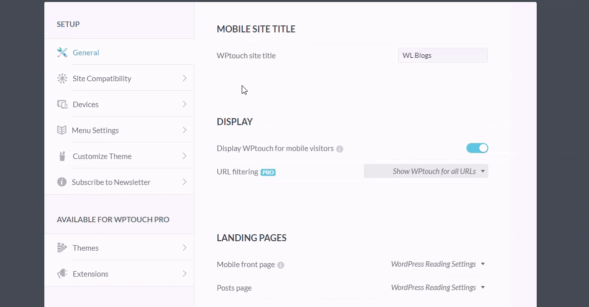
Once the WPtouch plugin is installed and activated, head to the dashboard, select WPtouch, and click on Settings.
Now, the WPtouch page opens with its settings. Here, you can find a variety of customization options, along with the themes and extensions available on the Pro plan.
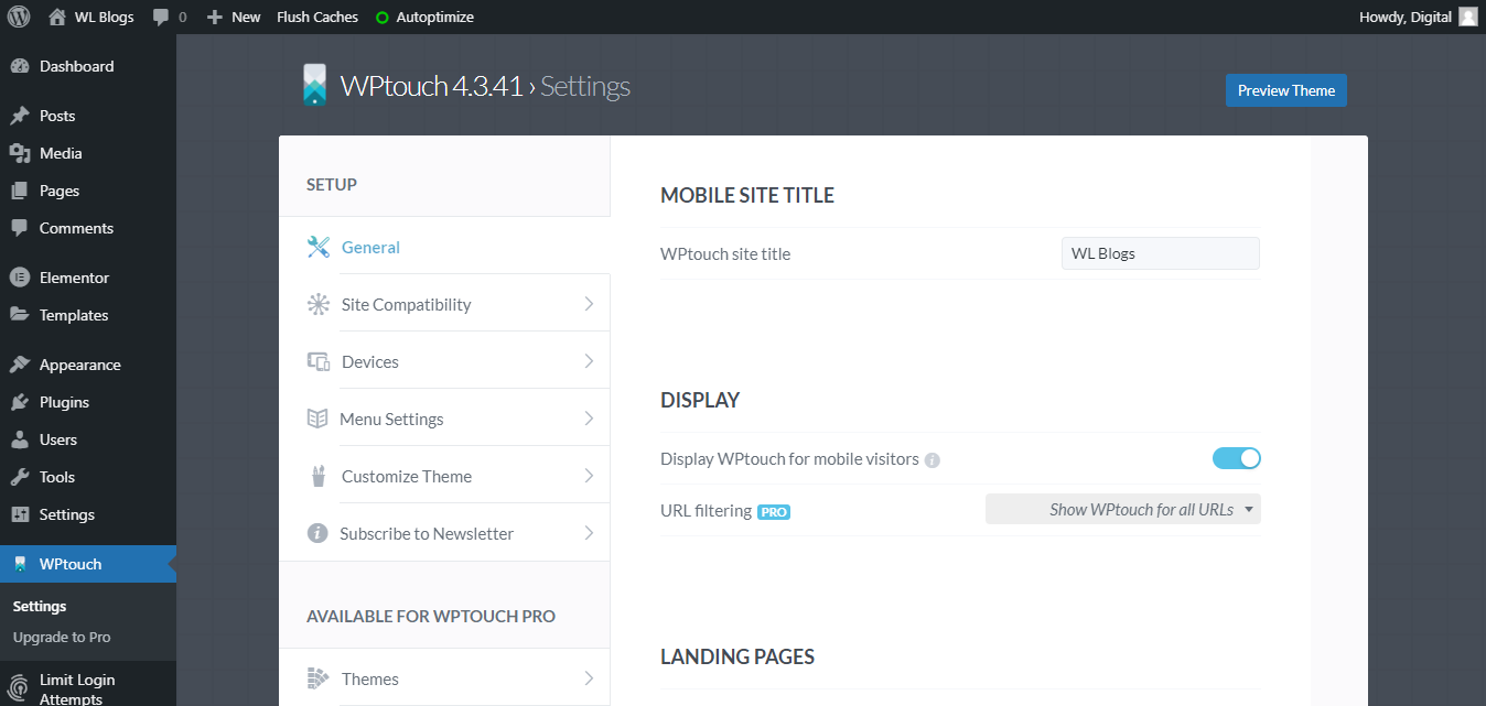
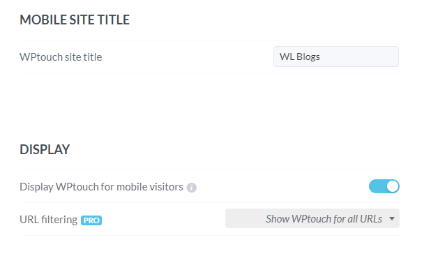
At the top of General settings, you have the choice to stick with the same site title or enter a new shorter one specifically for mobile users.
And you can also choose whether or not to display WPtouch for all of your mobile visitors.
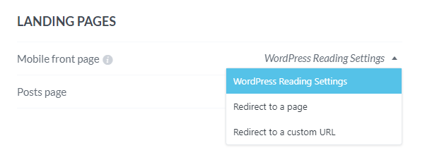
Right after that, you can choose whether to have the same landing page as your desktop or redirect the visitors to another page or an entirely new URL.
After that, you have a couple of viewability settings where you can choose whether to have a desktop/mobile toggle on your page and whether to enable zooming in on the page by the visitors.
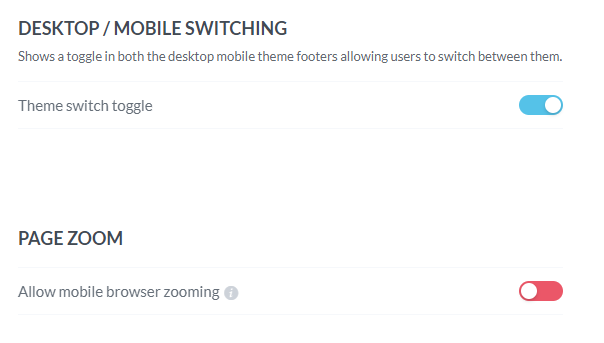
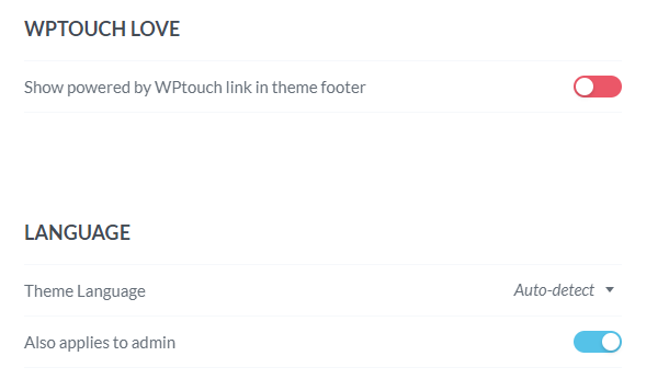
WPtouch leaves it to you whether or not to have the ‘Powered by WPtouch’ link on your website footer.
Also, you can choose the language of your choice, though ‘Auto-detect’ with the default theme’s language is the best choice.
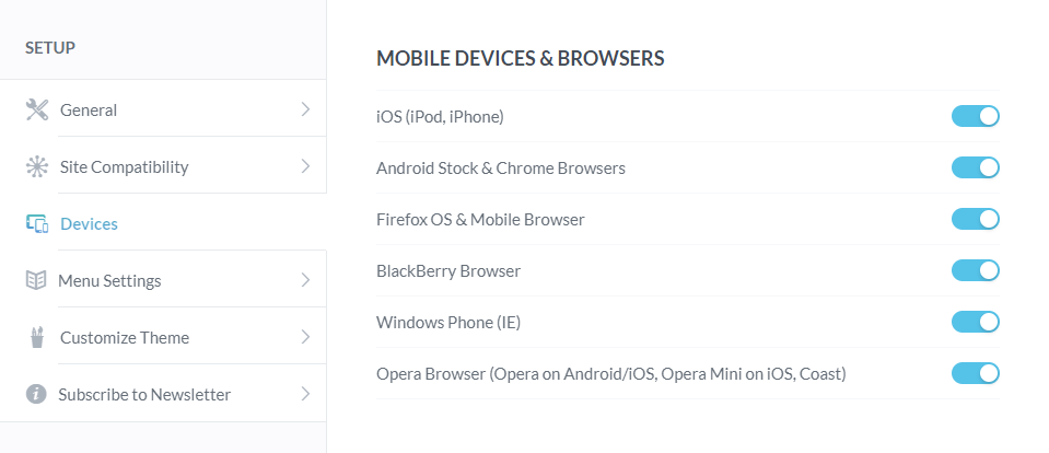
You can select the type of mobile devices and browsers where you need the WPtouch version of your website to be displayed from the Devices settings.
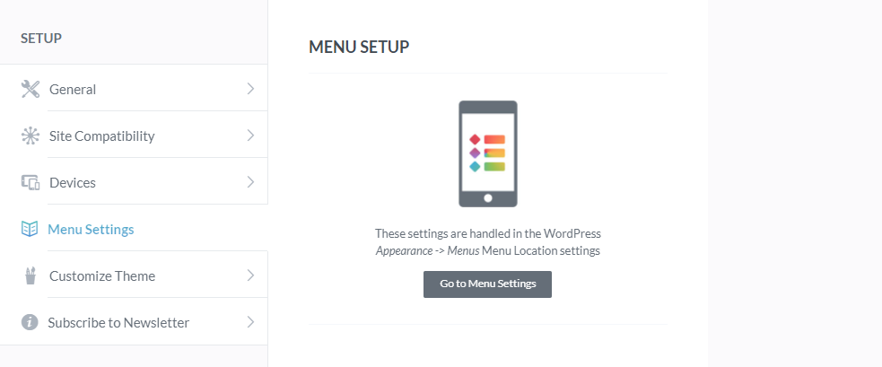
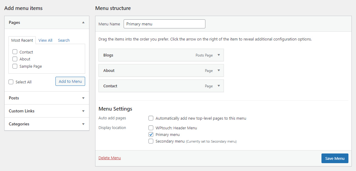
From the Menu Settings, you can customize the menu right from the default WordPress Menu settings.
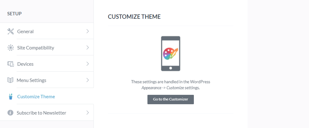
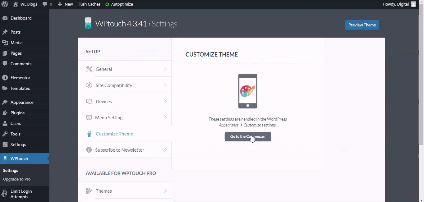
And the same applies to customizing your theme. Though WPtouch in its free version comes with only one default theme, you have the choice to customize it right from WordPress Theme Customization settings.
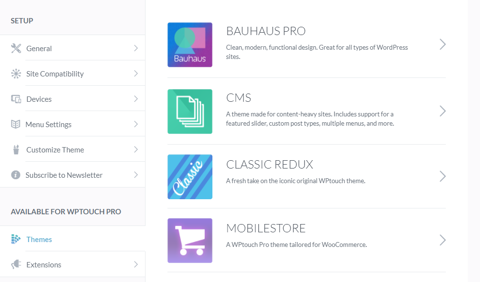
Also, we have WPtouch Pro options like Themes and Extensions available right in this settings menu.
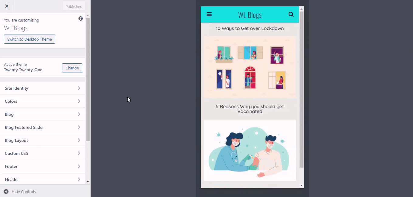
Once all the settings are customized accordingly, you can choose to preview the changes you made and take a look from a visitor’s perspective.
To do so, Click Preview Theme. The changes are automatically saved once you are done.
Now to test it out, let’s go to Google’s mobile-friendly Test and check our website.
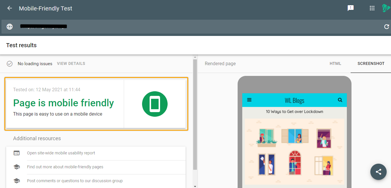
“Page is mobile-friendly.”
And that is how you can make your responsive website in no time. Now that you know how to use the WPtouch plugin to make your WordPress website responsive, let’s look at why we chose WPtouch of all the plugins.
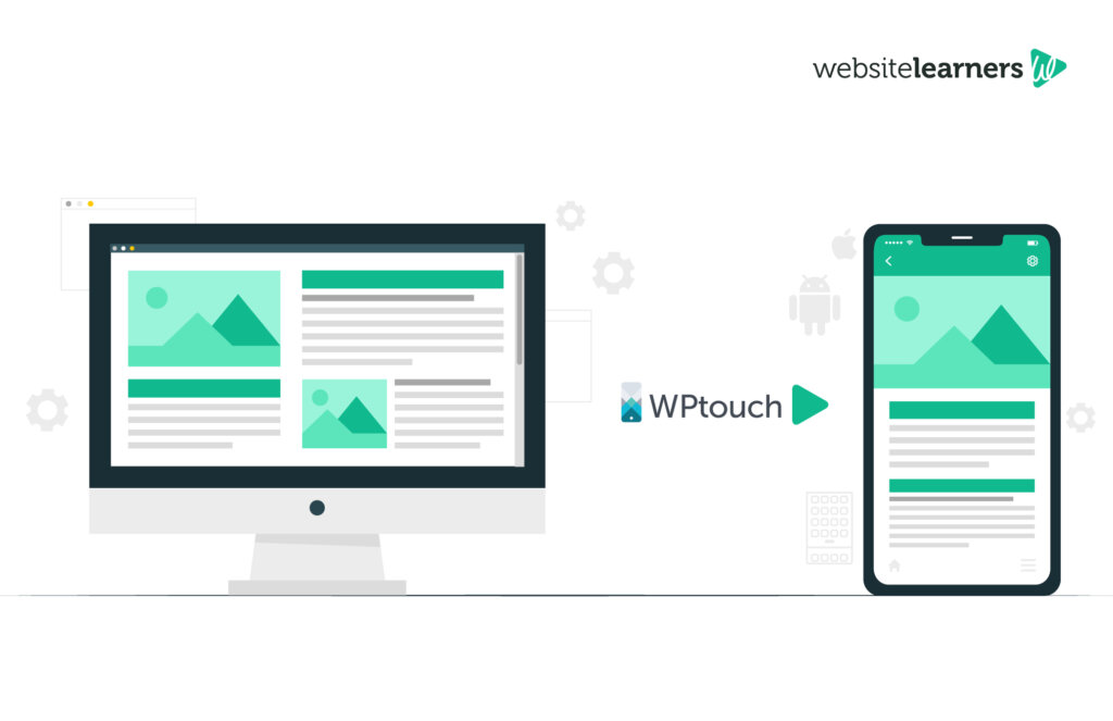
WPtouch is a WordPress mobile plugin that automatically adds a mobile-specific theme for your WordPress website. Being recommended by Google, WPtouch works by creating a mobile version of your website without using a subdomain or redirecting to a new URL.
With thousands of different plugins in the WordPress directory, how does WPtouch stand out?
Well, here are some of the features that make WPtouch the right choice to make the responsive website,
WPtouch is one of the very few plugins that have full WordPress customizer support for its users. This means that you can customize every part of your mobile theme right from the WordPress customizing section.
Be it customizing the theme or Menu, you can customize it right from the default WordPress settings. You can experiment with different colors, headings, images, and even the orientation of your screen.
WPtouch, with its unique themes, explicitly made for mobiles, makes sure that your website loads in no time. This ensures that the website loading time is faster than the usual responsive theme that’s used by WordPress websites.
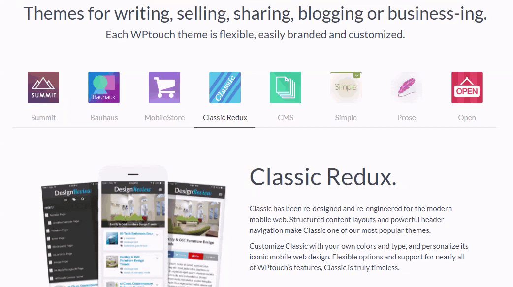
WPtouch consists of a total of eight different themes, each custom-made for specific purposes. For instance, Open, one of the themes, is made for physical stores that have a website, with built-in options for calling, operational hours, etc.
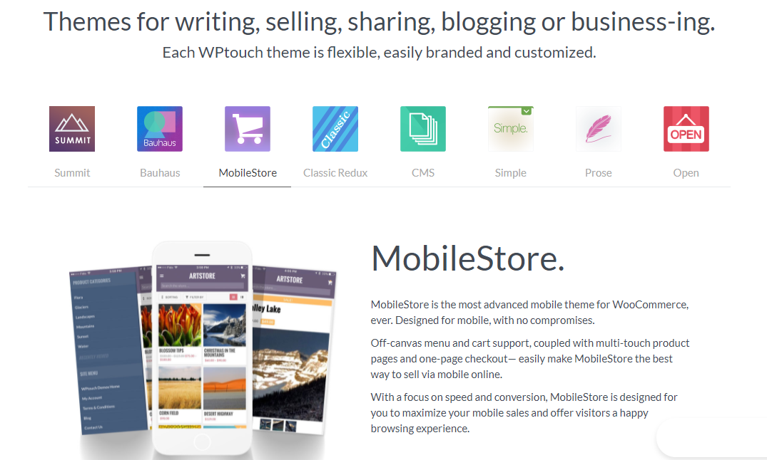
Another theme, MobileStore is exclusively built for eCommerce owners and helps them get more sales via mobile. Talking of eCommerce,
Of all the different websites on the Internet, it is crucial for eCommerce websites to be responsive. Because a responsive website not just increases the sales, but helps forming a lasting relationship with your customers.
To make your eCommerce website responsive using the free WPtouch plugin, all you need is to follow the same steps for a regular website,
And you got a responsive eCommerce website!
However, to have an edge over your competitors, you can make use of the eCommerce-specific theme that comes with the WPtouch premium version. With an eCommerce-specific theme for your website, you can utilize the various customization options that come with the tool. That is why,
Though the free version of the WPtouch plugin does the job of making your responsive website, you should consider opting for WPtouch Pro to explore the range of this plugin truly. WPtouch has four paid plans, namely Pro, Business, Developer, and Enterprise, starting at $79/year.
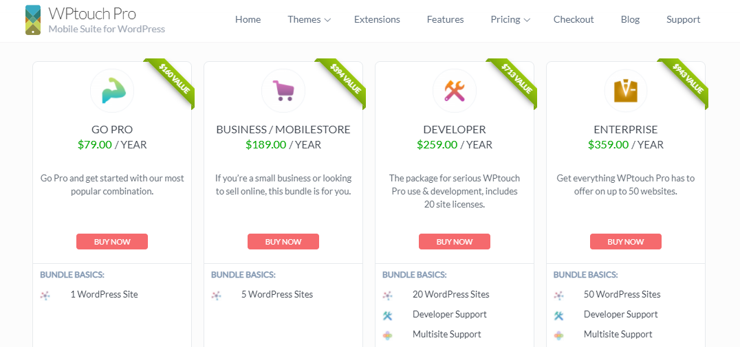
WPtouch, in its free version, has only one default theme that you can customize with. But WPtouch Pro plans have around eight exclusive and unique themes, each suitable for different genres like blogging, business, etc.
So, with a WPtouch Pro plan, you get to choose the theme of your choice and customize it further to match your needs.
Apart from different Themes, WPtouch also comes with various extensions that provide additional features along with the plugin. These add-ons include Google’s Accelerated Mobile Pages (AMP), Power pack for Page caching, etc.
With no further configuration required, these extensions are a great addition to the WPtouch Pro plans.
And with the paid WPtouch plans, you also get assistance from their professional customer support team.
It is always recommended to use a mobile-specific plugin like WPtouch to make your WordPress website responsive. In addition to that, here are some more tips that could help in making your WordPress website responsive.
The theme is pretty much the first thing you would change on your WordPress website. It dictates the entire look and feel of your website. In mobiles especially, a responsive theme gives the best user experience and decreases the bounce rate drastically.
So, you need to take your time and choose the one that’s both visually appealing and responsive on all devices.
Menu acts as the way your visitors navigate across your website. They take visitors across the multiple pages of your website and help them find what they are looking for, thus making them interact with your website as a whole.
So, you need to make the menu responsive so that no matter the size of the screen, it serves the purpose.
When it comes to smaller screens, only part of your entire content is going to be visible. So you need to make sure you engage the audience with the minimal text that’s visible at any moment on the screen.
At the end of the day, beyond the best user experience, your website content is what makes them stay. You need to learn how to put out content that sells, turning even casual visitors into potential customers.
Mobiles have started to play a huge part in worldwide Internet traffic. Nowadays, more and more people prefer the use of mobile over desktops to access websites. And they also believe that a website on mobile should look as good as on desktop.
85% of people think that a company’s website, when viewed on a mobile device, should be as good or better than its desktop website.
So, it is high time you make your responsive website and open up on a whole new set of traffic. And what better way to do that than use the Google recommended plugin WPtouch.
WPtouch, with its beginner-friendly and unique features, makes it really easy for website owners to have a responsive website. On upgrading to premium plans, you can experiment with various themes and choose one that suits your website.
If your WordPress website looks different on a mobile compared to a desktop, you are probably using a non-responsive theme or plugin.
Though most themes and plugins in WordPress are built to be responsive, you need to be careful in choosing the right ones for your website.
It is quite easy to have a responsive theme and make your website responsive. But to have a unique and separate theme for mobile, you need to install and use a mobile-specific plugin like WPtouch on your WordPress website.
It may sound too good to be true, but you can make your responsive website for free. WPtouch plugin comes for free with a built-in theme to make your website responsive.
To explore much more options and make full use of the plugin, you can always upgrade to one of the premium plans offered by the plugin.
Yes. WordPress websites, in general, are responsive compared to other platforms. However, the responsiveness of a WordPress website also depends upon the theme and plugins that are used in that particular website.
So, to have a responsive WordPress website, one needs to choose a responsive theme like Astra and install plugins like WPtouch.
Nowadays most of the new WordPress themes are mobile responsive, meaning they work well on smaller screens too. They adapt themselves to the screen size, looking equally good on all devices.
However, it is recommended to stick with popular themes like Astra, Divi, as they are trusted and proven to be responsive by thousands of websites.
Yes. While the WordPress theme makes your website responsive only up to an extent, it is the plugins that change the game. WordPress has several plugins that are specifically designed to make the website responsive.
One such WordPress mobile plugin is WPtouch, which automatically adds a mobile responsive theme to the WordPress website. It makes your website mobile-friendly without any kind of redirection or subdomain.
Yes. Elementor is an amazing website builder plugin in the WordPress directory that can help make the website responsive. Being one of the most widely used website builders, Elementor, by default, has capabilities to make the website responsive across devices.
In fact, Elementor has a separate Mobile editing menu, just like the desktop editing menu. This means that you can make device-specific design changes.
Do you want to learn WordPress to build any kind of website you want? Then this is the only course you need to take.
View CourseSEO isn't as difficult as you might think. Learn how to start growing organic traffic to your website with our easy to follow video .
Watch VideoSign up for our WordPress Course today!
Add a Comment
Leave a Comment